Graphic Designer
|
1. Who is the designer you chose to research?
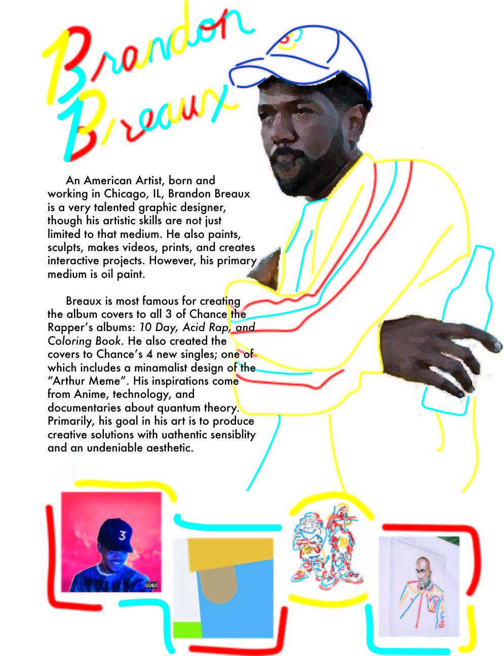
I chose to research Brandon Breaux. 2. What drew you to this designer? I really liked the album cover Coloring Book, by Chance the Rapper and wanted to know who was the artist behind it. I really liked his color scheme and simplicity of capturing Chance. Plus, it is a very iconic album and made the "3" hat famous as Chance's trademark. 3. How does your design mimic their style? Breaux's designs are pretty minimalist and capture bright, fun colors. I did that by copying his simple line work in bright, basic colors. His silhouette is created by bright yellow lines, with red and blue lines to add detail to his clothing. His hat was also created the same way and I even added in the iconic 3 on his hat to represent his work with Chance. Breaux also likes to particularly work with oil paint, mainly for body parts with skin. I replicated an oil painting for the parts of his exposed skin. 4. What is a new fact you learned about him/her? A new fact that I learned about Breaux is that he also created the " I Need Security" album cover for Chance as well. I knew about the album cover before I researched him and it is a coincidence that he also continued to work with Chance on his other album covers. |
Visual Storytelling Through Typography
|
|
|
1. What was the influence behind your design?
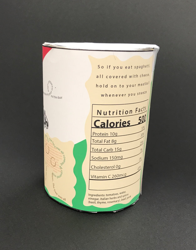
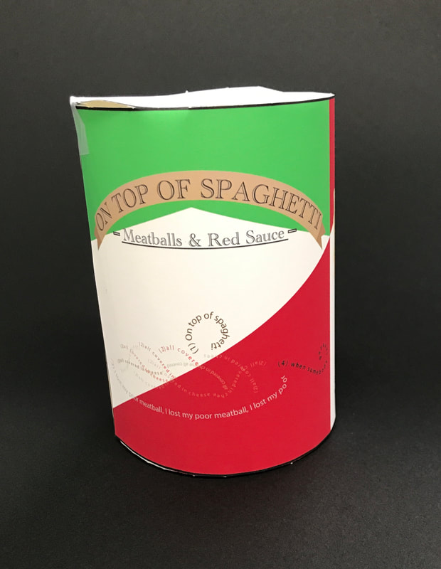
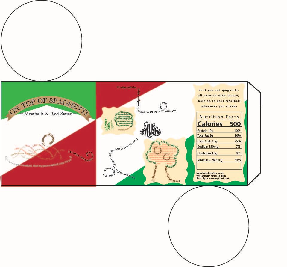
My influence came from regular spaghetti sauce cans and a campfire song I heard when I was younger about a runaway meatball. 2. Why did you choose the specific three-dimensional form? I specifically chose the cylindrical can design so that it is like the other can designs for sauces 3. What aspects did you incorporate into the story? Why? How? I incorporated the shapes and motions that the story has such as meatballs and spaghetti or the tree and bush. I did it so that the story could have pictures in it as well like a child's story. I did this by creating the silhouette of the shapes with the text in the poem. 4. What tricks/tools did you use to help design the package? Some tricks I used was incorporating color in the text. This really helped make the picture clearer to what they were supposed to represent. 5. What was most difficult about the assignment? The most difficult part was organizing the stanzas of words in a cleaner, coherent manner. |
Figure Design
|
1. Who is the person you chose to create a design about and why?
I chose to choose Bruno Mars because he is my favorite artist. 2. What are the specific words of phrases you chose to use in your design? Why?. I chose a quote where he explains where he got his inspiration for his stage name. I thought it was significant to his brand and that it was an interesting fact. 3. What images did you use in the creation of the design and why? I chose the setting of outer space, specifically on mars. I decided to combine several main elements in his album covers as well as collage a several pictures to create a mini him. 4. What did you do to specifically enhance your design beyond just using pictures? How did this help your design? I enhanced my design by tying it together with white line detailing. It really ties the pictures together and makes the whole thing work together well. 5. What was the hardest part of the assignment? The hardest part was finding pictures of good quality and at the right angle for me to make my mini Bruno. |

|
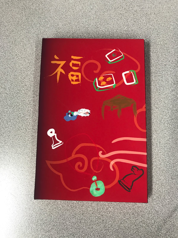
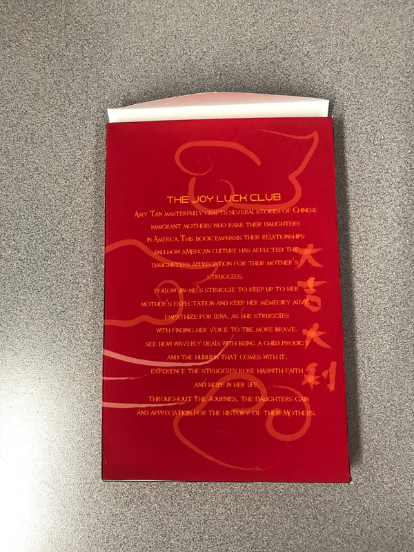
Book Package
|
|
