Portfolio
Pyramid Project
1) Discuss the process you went through when making your 3 Design Pyramid? What did you notice about your art making process? How did it evolve? Themes? Did you gain confidence in the design process? Did it get easier or harder and why?
When designing my project, I first experimented with the tools that Mr. Leake showed how to use. From there I would create this abstract design and I would work from there. Typically, my designs were based off one main thing that I created and really liked, and I added onto it based around that. I noticed that my art making evolved to be more complex in techniques and designs. I noticed that I tend to gravitate toward the blue color spectrum. As I added more skills to my arsenal, surprisingly, I found it harder to design because I had so many options to choose from and I couldn't decide where to start. I did however gain confidence in being able to do what imagine and making things look good.
2) What tools did you use and how did you use them?
I use the shape making tool often and use that to create clean looking geometric shapes. I tend to utilize the stroke and fill color. I also like using the blend tool because it is an easy way to create movement.
3) Choose one design and discuss the Focal Point and how it shows Movement.
In my line design, the focal point is the overlapping, dark circles. Lines lead toward that focal point, getting lighter as it approaches. Most of my lines lead towards the focal point, whether it is a line of ants, bird tracks, or a brush line. There is also a line of circles that are light in shade, and one of the circles even goes into my focal point.
4) What was most challenging about making the Designs?
The most challenging thing about making designs is knowing what you want to do and what direction you want to take it.
5) Would you do anything differently? What? Why?
I would try and get a consistent color scheme with all my designs so that my pyramid would look better and more put together when assembled. I think I would redo my line design to be more modern looking. I also wanted to add more detail to my retro-pattern design.
6) What would you like the audience to notice?
I think my audience will notice my gradient design since it is so neon and eye catching. Plus, I think it looks the most put together yet pleasing to look at.
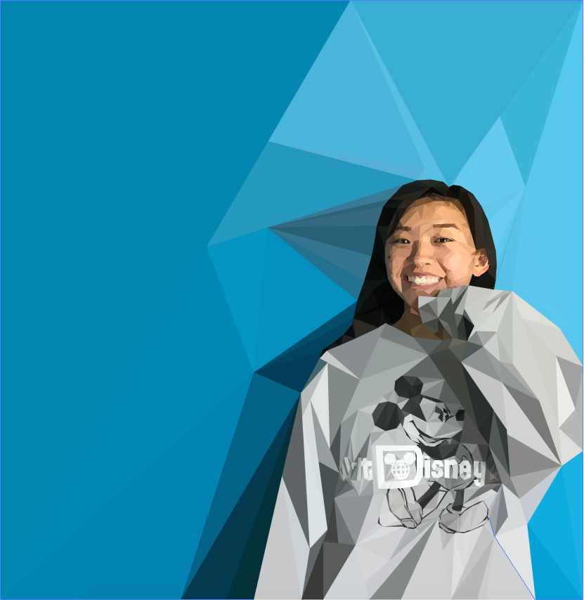
Polygonal Potrait
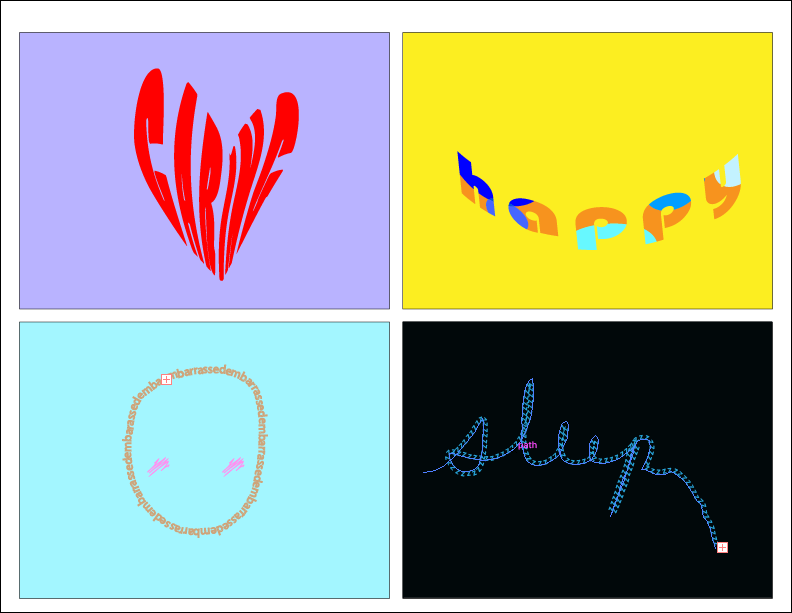
Emotional Words
Historical Quote Typography
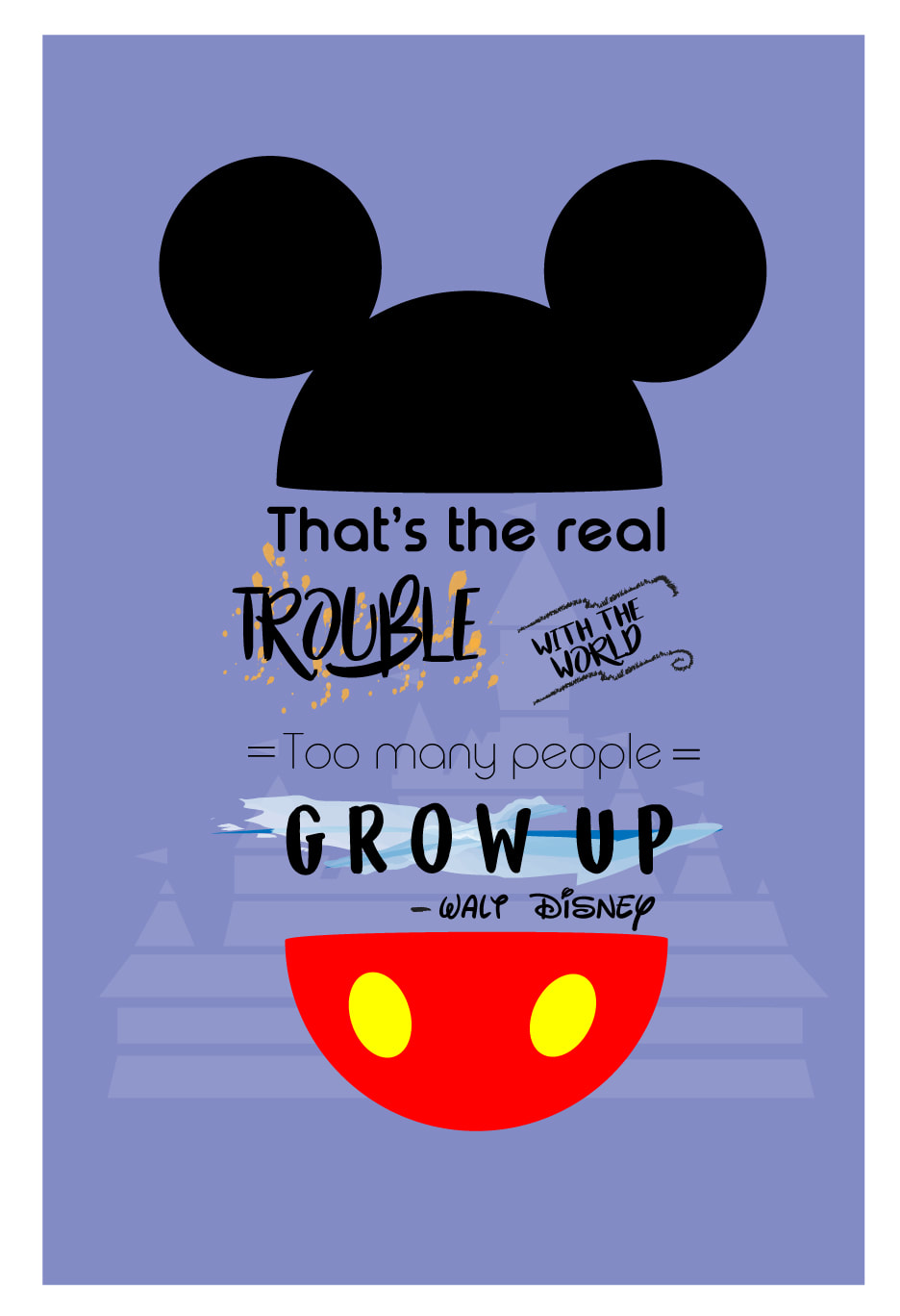
1)What is the quote you selected?
The quote I selected was: "That's the real trouble with the world, too many people grow up".
2)Who is the famous historical figure whose quote you are using? Provide a background of the person. Their date of birth, any movements they were apart of, how they influenced other people, what their mission was, etc. are things to include.
I am using Walt Disney, born December 5, 1901, as my famous historical figure. He was an entrepreneur and started his own company called Walt Disney. He was one of the first people to start making animations popular and created several popular animations such as Snow White and the Seven Dwarves, Fantasia, and the character Mickey Mouse. He used his animations to help support war bonds and the war effort of WWII and support American imperialism. He also used his animations to produce propaganda productions. He influenced other animators to also pursue their careers, but most importantly, his mission was to bring happiness into the world.
3) Why did you choose this quote? What were reasons you were initially drawn to it?
I chose this quote because I am a huge Disney fan and love the work of Disney. Walt Disney is such an inspiration to me because he was able to create content for people to enjoy and bring happiness to their lives. He created this whole style of how to tell a story and totally change animation at that time. I also like him because of how much he likes children, which is shown in this quote. I really like this quote because I find it very true that too many people grow up and stop having an imagination. I hope that when I grow up, I will not follow the footsteps of those kinds of people.
4) How did you make the your design look or feel like the quote? Talk specifically about colors, textures, techniques, etc.
I made the design look like the quote by adding the common Disney aspects such as the castle in the background and Mickey Mouse. I also gave the fonts a young, vibrant font that I thought promotes youth and fun. I also had Walt Disney in the font of his famous signature. The colors are very vibrant and pastel. The texture of the fonts is similar to calligraphic pens used in watercolors.
5) What was the most difficult part of the assignment?
The most difficult part of the assignment was choosing which quote from Walt Disney to use. I wanted to find a good quote that summed up his objectives, yet used words that I could manipulate to look aesthetically pleasing.
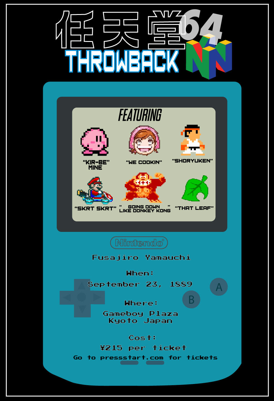
Concert Poster
|
1. What inspired this design?
The brand Nintendo inspired this design. Its game consoles inspired the iconic images and the games inspired the bands. 2. Who are the band members and how do they relate to the design? The band members are certain characters or aspects of Nintendo games. 3. When/where is the concert and why are they relevant? The concert was held September 23, 1889, which is the day that Nintendo was founded. It was also held in Kyoto, Japan, where Nintendo was founded. 4. What was the hardest part of the assignment? The hardest part of this assignment was making all the characters become pixelated versions of themselves. |
Package Design


|
1. What was the food you chose to make a package design for and why did you choose this food?
I chose to make a package design for milk and I chose this food because my mother used to make me drink a lot of milk as a kid and I think I would have enjoyed it more if it came in more fun packaging. 2. Describe the package you created. How does this design best work with the food? I made a package in the design of a cow. It includes the head, legs, and even the udders. This design works best with milk because milk comes from the cow. So the design insinuates that the milk came directly from the cow. 4) What technical challenges did you go through when making this design? The technical challenge was figuring out the dimensions and how the cow would fold. 5) Do you think you were successful when making this product? Why? I think I was fairly successful with this product because you can tell it is a cow. Plus it is strong and structured, and can stand up on its own. |
